Wednesday, May 21, 2014

Growing Ideas

Four years ago I began to write a story, never anticipating that it had the potential to become a novel. I had given up on it apparently, (and forgotten about it), because last summer as I was digging through an old drawer I stumbled upon a rough, aged notebook. I started to read it and couldn't put it down, and was surprised I'd written something so interesting so young. I picked up writing the novel again, and decided I wanted to illustrate it myself.

Most of the time book illustrations consist of ink or colored pencil, but I decided I wanted my book to be illustrated with the bright, vibrant colors of acrylic paint. Since the novel is somewhat medievalist, I thought of the bold pages of illuminated manuscripts. I didn't want full-on canvas panels for each illustration, so I started by cutting out cotton rectangles from old t-shirts and covering them in a layer of gesso. 


After the gesso dries, you can draw out a rectangle using a ruler and lightly sketch the plan within. Like all acrylic painting, the next step is to block out the base layers of your composition. 


After this essential part of the process, you're free to start adding detail. It's all about building up layers.


When you're finally satisfied with all the details you've added, you have your finished product and can move on to the next piece!


Sunday, December 22, 2013

Recycled Gift Ideas

We all find ourselves in that seasonal rush to scramble and find Christmas gifts for the family in time for the big day. Sometimes smaller, hand-made gifts hold more meaning, though, so when you have the time to sit down and get a little artistic, it can be a lot of fun. 

One artsy gift idea is making fragrant oil infusers out of used tea bottles. I peeled off the outer wrapper of a clean, empty bottle, and filled it about halfway with vegetable oil (the carrier for the essential oils that give it its fragrance), and put in about 40 drops of pure orange oil and 3 drops of peppermint extract per bottle. 
Then, using old scraps of colored paper, ribbon, string, and twine, I decorated the outside of the bottles. Tape is sufficient to hold the paper to the glass, especially rolled into a circle so it doesn't show, but yarn or twine is what you'll want to use to hold the ribbon to the bottle. You can also cut out some decorative paper and cover the cap, as well.

Then, for the infusion sticks, (which are traditionally long wooden rods inserted into the open bottle, which absorb the oil and disperse the scent in the air,) I used 6 unused chopsticks from take-out Chinese restaurants and bundled them up with string, attaching them to the outer bottle. To use, simply take the cap off and place the sticks in. Unlike a candle or lamp, do not light or use fire around these. Whenever the bottoms of the sticks are thoroughly soaked in oil, (a few days) flip them around to keep the aroma circulating.                              
Another creative gift idea is crocheting or knitting drawstring pouches and filling them with a loved one's favorite soap. (I like the organic, hand-crafted types.) Knit or crochet a 5 in. x 7 in. rectangle, and "sew" the edges together using the same yarn you used to make it, leaving one end open. Then finger-crochet a 1 ft. chain and weave through the fabric near the opening, about one inch down, making sure the two tails come out level on the front. You can then insert the soap (or other gift of your choice) inside, and pull the cord taut, and you've got your drawstring bag. :)            
                                                                       I hope these gift ideas help everyone have a      wonderful holiday; and a Merry  Christmas to  all.                                                                                                                                                                                                                   


Monday, September 2, 2013

Monarch's Journey


The painting is finished, and it's truly been a great adventure. Each time we produce a new painting, we learn a little bit more about art, so I really enjoyed this project, even though it was a commission, and not my own idea.
The butterfly is the final detail here; the colors I used on his wings were various blends of peaches, white, orange, yellow, and brown. The borders are black with pale bluish-white spots. Overall, I'm happy with how it turned out!

Sunday, August 18, 2013

The Flowers


After pulling out the shapes in the background, I started building layers in the foreground, namely on the flowers and the butterfly. I haven't finished the foreground yet, but you can see the beginnings of small brushstrokes with magentas and blues on the flowers. Generally speaking, you can capture a sense of shadow by the use of violets, which I placed on the left side of the flowers, since the light source is on the right side. The part of the object that faces the light source is more white. Anyway, this is just an update on how the painting is going---I'd recommend looking back at the photos on the past few posts to see the journey it's undergone, and how it's coming along. The artistic process truly is an interesting thing. :)
Until next time!

Thursday, August 8, 2013

Butterfly Painting

The painting is definitely starting to look more like a painting now! (By the way, this photo was taken under florescent light, which is why it has a yellow glow; in reality, it's a more "green" green.)
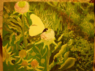
So, you may be thinking, how do I start? How does the painting get from point A to point B? A teacher once told me that if you're near-sighted, you can squint at an image (such as the photograph I'm using as a reference for this painting) and separate in your mind the areas of light and dark. Then you "blob" on those general areas, and after time, and layers, you refine them. Well, I may not be nearsighted, but I mixed a dark green and painted on the blotches you see in the upper right, a dark brownish-green for the "stripe" that follows, and a dark green, nearly black, once more for the floral leaves at the bottom right (and on those I used a sponge brush---it's great for capturing the cluster shape!) Later, I overlapped lighter greens, turquoises and yellows over these with finer, more whimsical strokes to capture the leaves that are getting sun exposure. This is where the medium green of the background comes in handy, because you just "pull" these 3D shapes out with different tones and shades, without having to paint texture over 100% of the surface.

One thing to keep in mind is that the colors don't have to be completely mixed for this sort of grassy background; a little variation is nice. If you've ever seen Durer's "The Large Turf," you'll know what I mean. So, for all my perfectionist friends out there, if you over-mix your paint, it may not have the same complex subtleties. This is especially true for the grass blades: layers of pear-greens, evergreens, browns, yellows, blues, and violets, semi-blended, make the grass look more real, along with varying values (darkness).

Next step coming soon!

Friday, August 2, 2013

Painting with Acrylic

Recently I got a commission to do a painting, and made the choice to use acrylic paint. Today I realized, "Wait, I've been talking a lot about painting with acrylic on my blog, but it's been kind of sporadic, and I haven't specifically dedicated a post to it." So, I figured since I'm working on a project right now, I can sort of give a demo for each step of an acrylic painting---at least Joelle-style. 

I will warn you now, my way of making art is a little "all-over the place," and doesn't really look like art until the very end, when I tie all the loose strings together. So, if you're having trouble following the process, just message me or wait until the final post for the project is up and maybe then the "big picture" will help.

One technique a lot of art teachers recommend when using acrylic is blocking out the general shapes and areas with a base color. This base color is often light or medium in shade, because some acrylic paints are translucent when you coat a light layer over a darker one, and it can look tacky. If you make that mistake, it's not impossible to fix, but takes several coats of white to amend the problem.

Please take a look at the base layers I've painted, and I'll tell you what I've done so far:
Since this is based off of a photograph I took of a monarch butterfly, I have a very reliable reference picture, which can be seen below. I used a large (3/4 in.) nylon brush to paint a green background, avoiding the areas where I previously sketched the main components of the composition. This green is called "Roi Evergreen," and normally I don't use paint straight out of the tube, but it was a good medium grass-color that would be just the right tone for a base layer, not too light or too dark. This way, it will be easier to bring out the highlights and the shadows. Since the major color in the monarch's wings was peach, that was the layer I chose for that shape, and a light lavender for the flowers on the thistles. Base layers don't have to be perfect, even coats, but they should offer a good foundation.

Here's the photograph:
More to come!


Thursday, July 25, 2013

Finished Welcome Sign- Plus extra tips!

The Welcome Sign project is finally finished, and it's great to see the piece in its complete form. It makes a nice, rustic entrance decoration for almost any home, and is just fun to make in and of itself. :)


As you can see, I added a twine flower and border to the piece, and glued the driftwood down. 
Any hot-glue or super-glue works; I used both. 


If you want to use a water-proofing agent to coat the piece, it's important to follow the directions on the can. You may choose not to water-proof it, since the stuff can be highly flammable; but, if you do, I'd recommend a heavy-duty version, like the kind used on shoes. You'll want to spray 2-3 even layers, going in rows, across the piece to give it a good coat. The purpose of this is to prevent the chipping of the acrylic paint with weather/age, so spraying the twine and found objects really isn't necessary. 

Enjoy!