Sunday, August 18, 2013

The Flowers


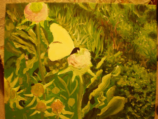
After pulling out the shapes in the background, I started building layers in the foreground, namely on the flowers and the butterfly. I haven't finished the foreground yet, but you can see the beginnings of small brushstrokes with magentas and blues on the flowers. Generally speaking, you can capture a sense of shadow by the use of violets, which I placed on the left side of the flowers, since the light source is on the right side. The part of the object that faces the light source is more white. Anyway, this is just an update on how the painting is going---I'd recommend looking back at the photos on the past few posts to see the journey it's undergone, and how it's coming along. The artistic process truly is an interesting thing. :)
Until next time!

Thursday, August 8, 2013

Butterfly Painting

The painting is definitely starting to look more like a painting now! (By the way, this photo was taken under florescent light, which is why it has a yellow glow; in reality, it's a more "green" green.)
So, you may be thinking, how do I start? How does the painting get from point A to point B? A teacher once told me that if you're near-sighted, you can squint at an image (such as the photograph I'm using as a reference for this painting) and separate in your mind the areas of light and dark. Then you "blob" on those general areas, and after time, and layers, you refine them. Well, I may not be nearsighted, but I mixed a dark green and painted on the blotches you see in the upper right, a dark brownish-green for the "stripe" that follows, and a dark green, nearly black, once more for the floral leaves at the bottom right (and on those I used a sponge brush---it's great for capturing the cluster shape!) Later, I overlapped lighter greens, turquoises and yellows over these with finer, more whimsical strokes to capture the leaves that are getting sun exposure. This is where the medium green of the background comes in handy, because you just "pull" these 3D shapes out with different tones and shades, without having to paint texture over 100% of the surface.

One thing to keep in mind is that the colors don't have to be completely mixed for this sort of grassy background; a little variation is nice. If you've ever seen Durer's "The Large Turf," you'll know what I mean. So, for all my perfectionist friends out there, if you over-mix your paint, it may not have the same complex subtleties. This is especially true for the grass blades: layers of pear-greens, evergreens, browns, yellows, blues, and violets, semi-blended, make the grass look more real, along with varying values (darkness).

Next step coming soon!

Friday, August 2, 2013

Painting with Acrylic

Recently I got a commission to do a painting, and made the choice to use acrylic paint. Today I realized, "Wait, I've been talking a lot about painting with acrylic on my blog, but it's been kind of sporadic, and I haven't specifically dedicated a post to it." So, I figured since I'm working on a project right now, I can sort of give a demo for each step of an acrylic painting---at least Joelle-style. 

I will warn you now, my way of making art is a little "all-over the place," and doesn't really look like art until the very end, when I tie all the loose strings together. So, if you're having trouble following the process, just message me or wait until the final post for the project is up and maybe then the "big picture" will help.

One technique a lot of art teachers recommend when using acrylic is blocking out the general shapes and areas with a base color. This base color is often light or medium in shade, because some acrylic paints are translucent when you coat a light layer over a darker one, and it can look tacky. If you make that mistake, it's not impossible to fix, but takes several coats of white to amend the problem.

Please take a look at the base layers I've painted, and I'll tell you what I've done so far:
Since this is based off of a photograph I took of a monarch butterfly, I have a very reliable reference picture, which can be seen below. I used a large (3/4 in.) nylon brush to paint a green background, avoiding the areas where I previously sketched the main components of the composition. This green is called "Roi Evergreen," and normally I don't use paint straight out of the tube, but it was a good medium grass-color that would be just the right tone for a base layer, not too light or too dark. This way, it will be easier to bring out the highlights and the shadows. Since the major color in the monarch's wings was peach, that was the layer I chose for that shape, and a light lavender for the flowers on the thistles. Base layers don't have to be perfect, even coats, but they should offer a good foundation.

Here's the photograph:
More to come!


Thursday, July 25, 2013

Finished Welcome Sign- Plus extra tips!

The Welcome Sign project is finally finished, and it's great to see the piece in its complete form. It makes a nice, rustic entrance decoration for almost any home, and is just fun to make in and of itself. :)


As you can see, I added a twine flower and border to the piece, and glued the driftwood down. 
Any hot-glue or super-glue works; I used both. 


If you want to use a water-proofing agent to coat the piece, it's important to follow the directions on the can. You may choose not to water-proof it, since the stuff can be highly flammable; but, if you do, I'd recommend a heavy-duty version, like the kind used on shoes. You'll want to spray 2-3 even layers, going in rows, across the piece to give it a good coat. The purpose of this is to prevent the chipping of the acrylic paint with weather/age, so spraying the twine and found objects really isn't necessary. 

Enjoy!


Tuesday, July 23, 2013

Welcome Sign Continued...Almost Done!

As the title indicates, our welcome sign is almost complete. I've painted on the daisies and blue-sky pattern letters, and it has an over-all welcoming outdoor feel. After painting the surface, I also chose earthy colors to cover the sides with, although you can't see those in the picture. I would choose colors that compliment the overall composition, but some nice earth-tones for outdoor artwork are muted greens, reddish browns, and dark golds. I would follow the same general rule for painting the back, which may or may not be visible depending on the owner's choice of display.
After painting the surfaces, it's time to place your found objects and play around with a composition that is aesthetically pleasing. I still intend to add twine and other stones to this piece, but here's what I have so far:
The two pieces of drift-wood on either side, and the stone at the bottom-right, all help give the piece balance and an earthy feel. This is important criteria to consider whenever you're arranging a piece of artwork: go with your gut, and if something feels/looks off, it probably is. 

I decided to use a strong super-glue to attach my found objects, and am debating between glue or nails for attaching the twine. Nails would look more rustic, but it's also important to be cautious and not damage the work. If anyone has suggestions, let me know! The piece should be finished in the next post. :)


Saturday, July 20, 2013

Follow-Up on Welcome Sign

The next step in crafting a Welcome sign is coating the board in gesso. I start in one direction, such as portrait orientation, and brush a single layer on. Then, after it dries, I brush on a second layer in the opposite direction (landscape.) While the layers of gesso are drying, I dab the edges of the board, which are more spongy in texture, to fill in the craters. Once dry, you can flip the board over and cover the back in the same manner as the front. (I'd recommend doing the whole process over several layers of newspaper.) 
(Also, my brush had fresh gesso in it when I took this photo. I would not recommend letting it dry with the paint in it, or forgetting about it, during the process.)

I actually changed my Welcome-sign design since last post. Someone pointed out to me that "Welcome to my home" carries the connotation that the owner of the piece is single or lives alone, and changing the phrase to "our home" would have just the opposite connotation. To make the sign more versatile, I changed the phrase to "Welcome to this home."

Also, though still rustic, I decided to replace the chicken and tree with daisies (which only have stems right now), and to fill the font in with a sky-blue, cloud pattern. Most of what you see in the painting below are just base layers, meaning that I haven't gotten any of the details in yet, and the design is still a little rough; but the concept is present in that the warm colors help establish the mood of a welcoming, warm home. Here's what I've got so far:
This upcoming week I'll be cleaning up the edges, adding daisies, clouds, and maybe even butterflies, and also looking for found objects. My hope is to have some smooth stones and twigs to paste onto the surface, and twine to either crochet or line around the edges. If anyone has any questions about the painting process, (I'm using acrylic,) feel free to ask! Until then, have a great week. :)

Sunday, July 14, 2013

The Welcoming Committee

Yesterday, while I was speaking to one of my mother's friends about a commissioned piece of artwork, the idea popped into my head of designing a piece that would not only be a fun project, but also compliment someone's home. After all, whenever people buy artwork for a home or business, they consider how it enhances the space. 

Growing up in the Midwest, I've seen a lot of cute welcoming mats in front of doors, a lot of decorative key-stones and garden-gnomes, and LOTS of signs that say phrases like, "Welcome to our home!" or "Mi casa es tu casa." I wanted to make a piece of art that would act as a welcoming committee for a house, that would combine found objects and natural materials to make the project meaningful and fun. 

Another part of the inspiration was the fact that I had three slabs of fine-grain, heavy-weight particle board that I thought of gesso-ing over and making paintings with. It soon occurred to me that even though they would make great "canvases," they were far too heavy to place hanging fixtures in, as they would tear the wall, or be torn themselves. So, I decided the boards will make a great sitting decoration, something that can lean against a brick wall on someone's porch. 


After coating the board with a layer of gesso, I plan on painting some background images (with acrylic paint) of flowers, trees, and a chicken—your basic rustic scenery. Then, in the foreground, will be the words, "Welcome to my home" in stylistic format. Once the painting layer is finished, I plan on applying bits of sea glass, stones, flattened leaves and flowers, twine, etc. onto the surface using molding paste or some other adhesive. After the colors and shapes are all in, the board can be sealed with matte medium or a water-proofer, since it will be outside. 

Here's a very basic sketch for the background-painting:


Hopefully it will be cute! This is a slightly long-term project in that it can't be done in a typical afternoon, so I'll be posting every few days to once a week on the step-by-step process as I complete it myself. Keep your eyes peeled!