Sunday, August 18, 2013

The Flowers


After pulling out the shapes in the background, I started building layers in the foreground, namely on the flowers and the butterfly. I haven't finished the foreground yet, but you can see the beginnings of small brushstrokes with magentas and blues on the flowers. Generally speaking, you can capture a sense of shadow by the use of violets, which I placed on the left side of the flowers, since the light source is on the right side. The part of the object that faces the light source is more white. Anyway, this is just an update on how the painting is going---I'd recommend looking back at the photos on the past few posts to see the journey it's undergone, and how it's coming along. The artistic process truly is an interesting thing. :)
Until next time!

Thursday, August 8, 2013

Butterfly Painting

The painting is definitely starting to look more like a painting now! (By the way, this photo was taken under florescent light, which is why it has a yellow glow; in reality, it's a more "green" green.)
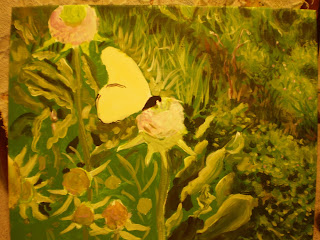
So, you may be thinking, how do I start? How does the painting get from point A to point B? A teacher once told me that if you're near-sighted, you can squint at an image (such as the photograph I'm using as a reference for this painting) and separate in your mind the areas of light and dark. Then you "blob" on those general areas, and after time, and layers, you refine them. Well, I may not be nearsighted, but I mixed a dark green and painted on the blotches you see in the upper right, a dark brownish-green for the "stripe" that follows, and a dark green, nearly black, once more for the floral leaves at the bottom right (and on those I used a sponge brush---it's great for capturing the cluster shape!) Later, I overlapped lighter greens, turquoises and yellows over these with finer, more whimsical strokes to capture the leaves that are getting sun exposure. This is where the medium green of the background comes in handy, because you just "pull" these 3D shapes out with different tones and shades, without having to paint texture over 100% of the surface.

One thing to keep in mind is that the colors don't have to be completely mixed for this sort of grassy background; a little variation is nice. If you've ever seen Durer's "The Large Turf," you'll know what I mean. So, for all my perfectionist friends out there, if you over-mix your paint, it may not have the same complex subtleties. This is especially true for the grass blades: layers of pear-greens, evergreens, browns, yellows, blues, and violets, semi-blended, make the grass look more real, along with varying values (darkness).

Next step coming soon!

Friday, August 2, 2013

Painting with Acrylic

Recently I got a commission to do a painting, and made the choice to use acrylic paint. Today I realized, "Wait, I've been talking a lot about painting with acrylic on my blog, but it's been kind of sporadic, and I haven't specifically dedicated a post to it." So, I figured since I'm working on a project right now, I can sort of give a demo for each step of an acrylic painting---at least Joelle-style. 

I will warn you now, my way of making art is a little "all-over the place," and doesn't really look like art until the very end, when I tie all the loose strings together. So, if you're having trouble following the process, just message me or wait until the final post for the project is up and maybe then the "big picture" will help.

One technique a lot of art teachers recommend when using acrylic is blocking out the general shapes and areas with a base color. This base color is often light or medium in shade, because some acrylic paints are translucent when you coat a light layer over a darker one, and it can look tacky. If you make that mistake, it's not impossible to fix, but takes several coats of white to amend the problem.

Please take a look at the base layers I've painted, and I'll tell you what I've done so far:
Since this is based off of a photograph I took of a monarch butterfly, I have a very reliable reference picture, which can be seen below. I used a large (3/4 in.) nylon brush to paint a green background, avoiding the areas where I previously sketched the main components of the composition. This green is called "Roi Evergreen," and normally I don't use paint straight out of the tube, but it was a good medium grass-color that would be just the right tone for a base layer, not too light or too dark. This way, it will be easier to bring out the highlights and the shadows. Since the major color in the monarch's wings was peach, that was the layer I chose for that shape, and a light lavender for the flowers on the thistles. Base layers don't have to be perfect, even coats, but they should offer a good foundation.

Here's the photograph:
More to come!